Lightdash Merch
Wearable, functional pieces that take the Lightdash brand off the screen. A black base, purple accents, pixel icons and one rule: never in the same place twice.
Freelance concept, design and art direction for Lightdash, 2025.
Problem.
Extend the Lightdash brand beyond screens and events. Build a set of wearable and functional items that align with the product's visual language, and create consistency between product, booth and physical experience.
Craft.
Worn daily, not just at events.
Represent the company without heavy branding or slogans. Details, materials and colour accents do the talking. Small custom choices, like drawstring colour, patch sets and limited drops, reflect the flexibility that defines Lightdash as a product.
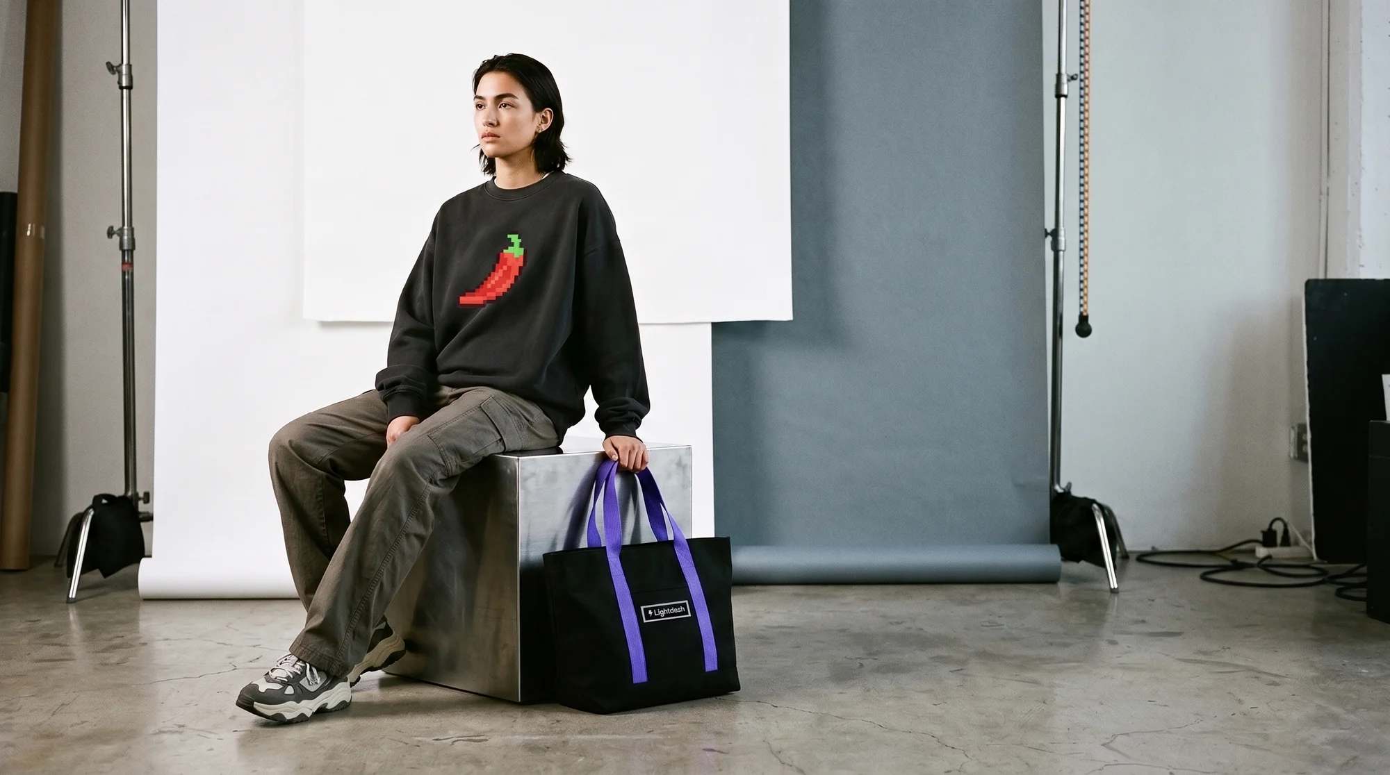
Chilli sweatshirt and tote. 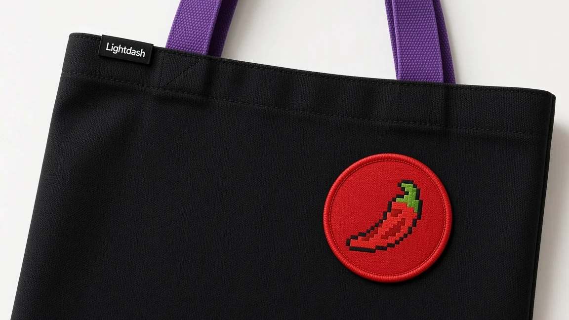
A nod to the Lightdash hot sauce. 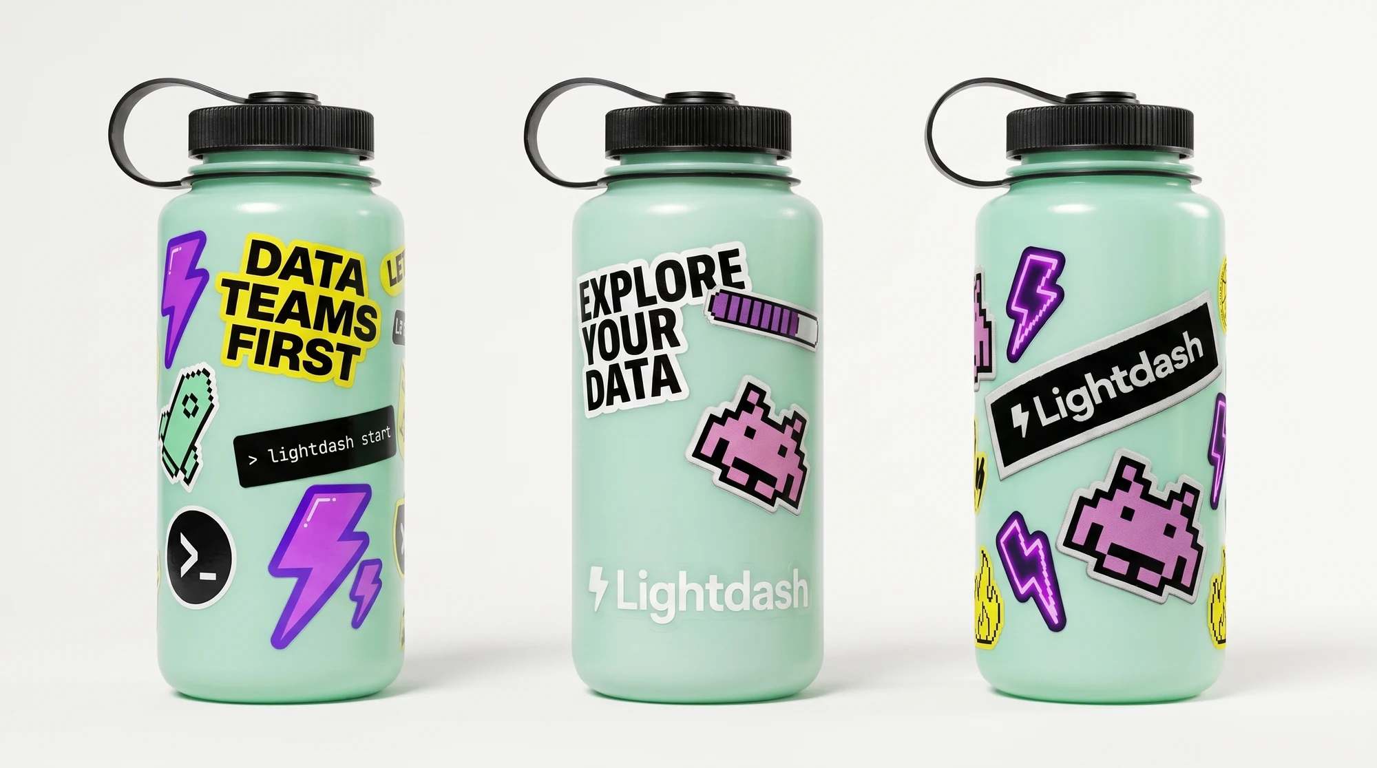
Stickers on a bottle. Restraint first.
The foundation of the system. Wearable, neutral, long-term. No oversized graphics or slogans, just fit, form and fabric quality, with details aligned to the Lightdash interface. Clean grids, controlled spacing, black base. Staples that anchor the brand and can be worn daily without feeling like merch.
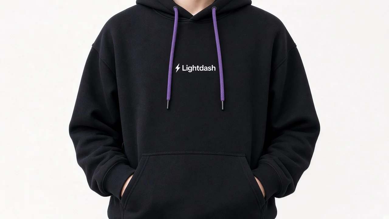
Visual restraint. 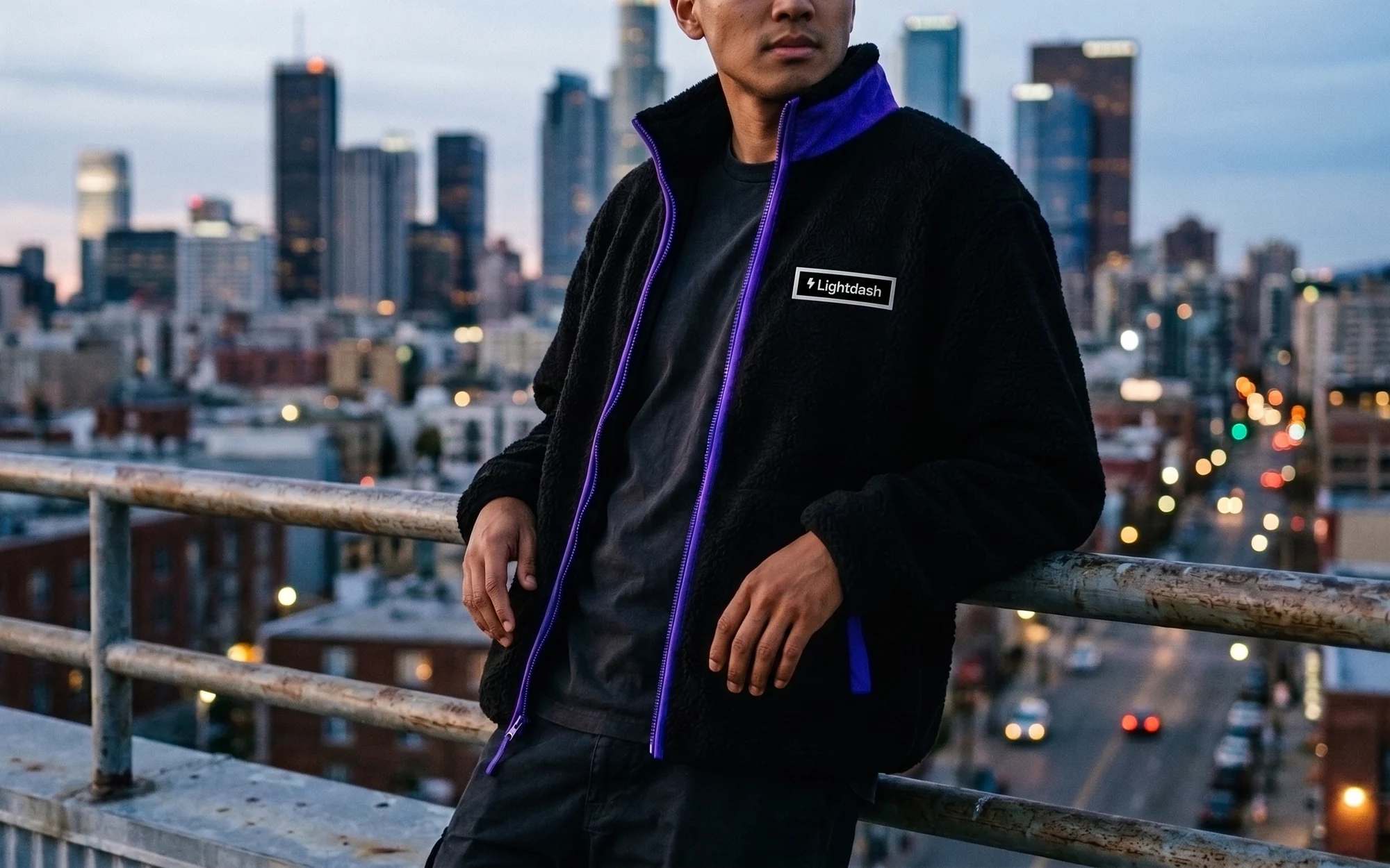
Sherpa fleece. 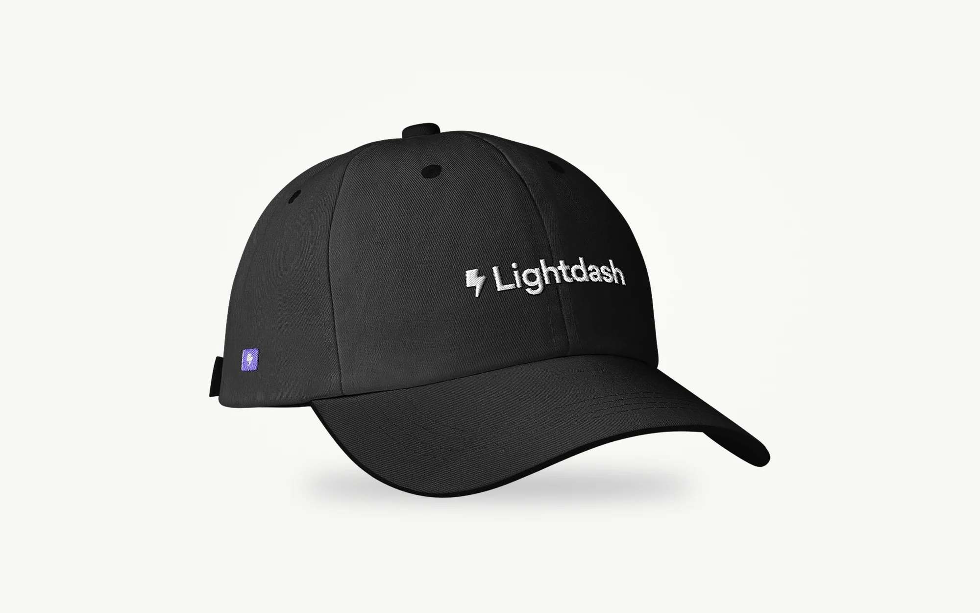
Cap. Never in the same place twice.
A mix of screenprints and patches using Lightdash icons in new ways. Stitched elements, pixel graphics and printed motifs build a modular, layered look. Icons appear on sleeves, backs or cords, never in the same place twice. Matte finishes keep the focus on texture and contrast, not gloss.
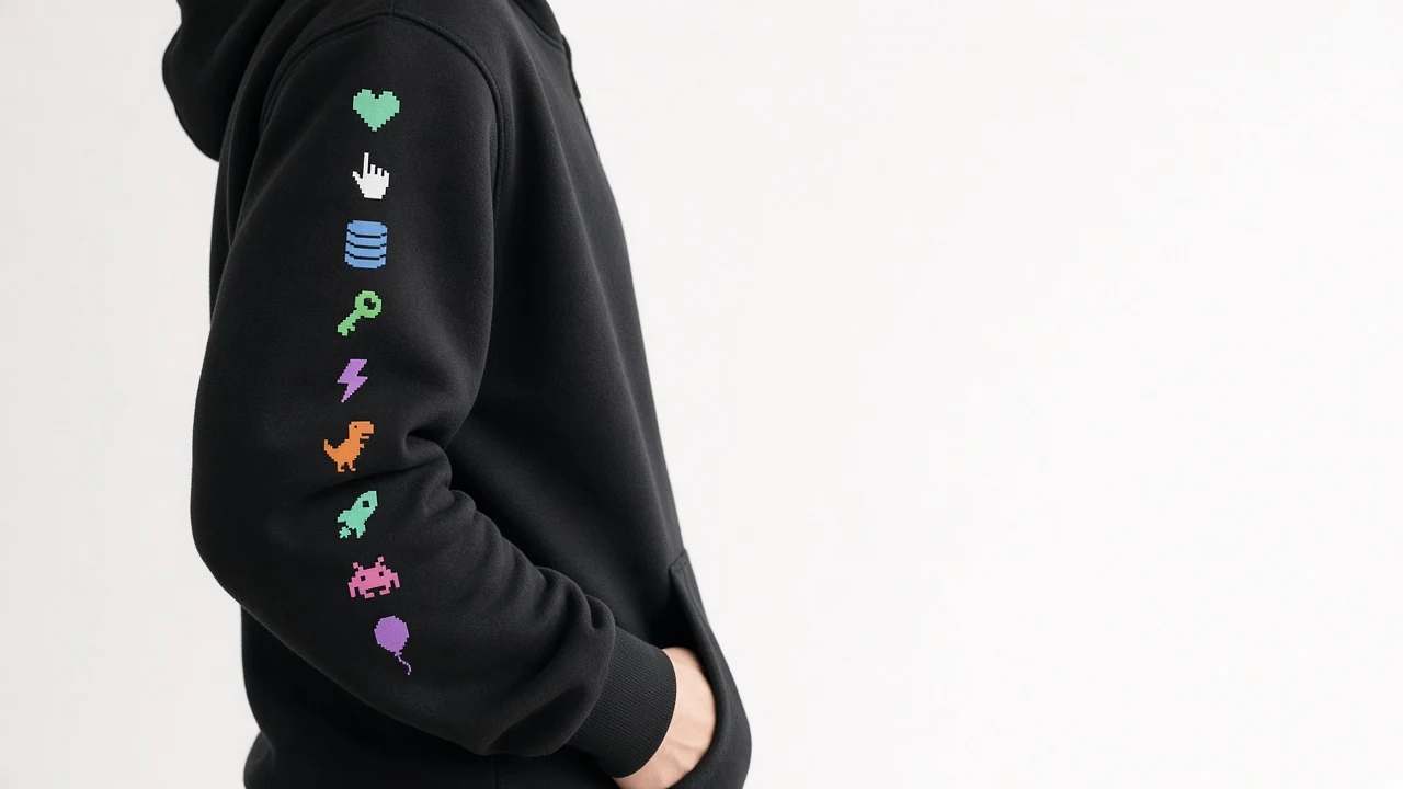
Pixel icons down the sleeve. 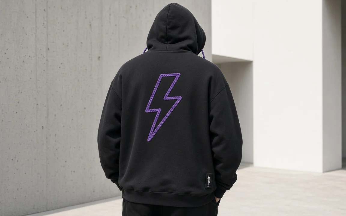
The bolt. 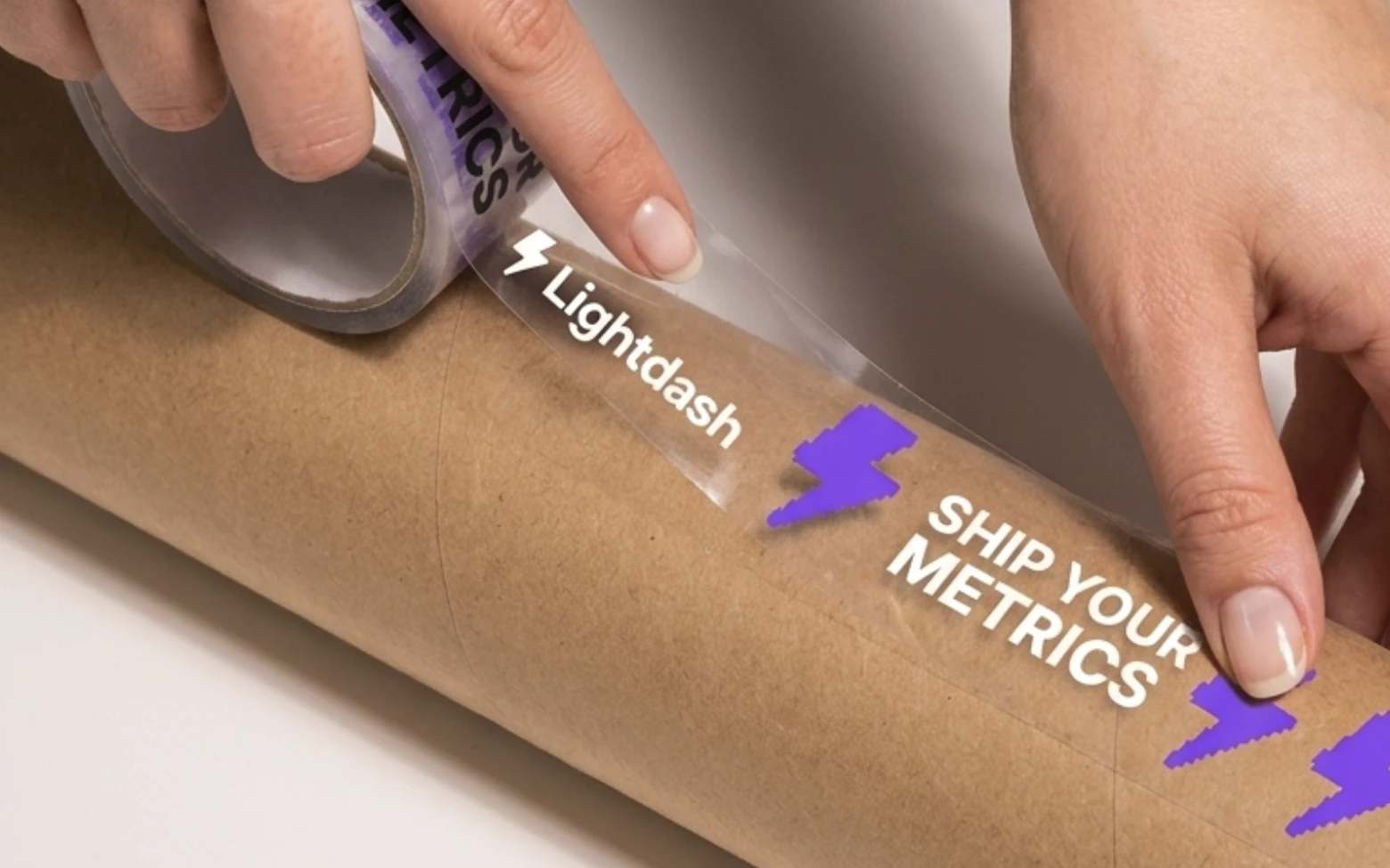
Ship your metrics tape. Screenprint, then patches.
One hoodie option layers the two techniques. A tonal wordmark is screenprinted first, then embroidered patches are stitched on top, so the same base print can carry a different patch pair each time.
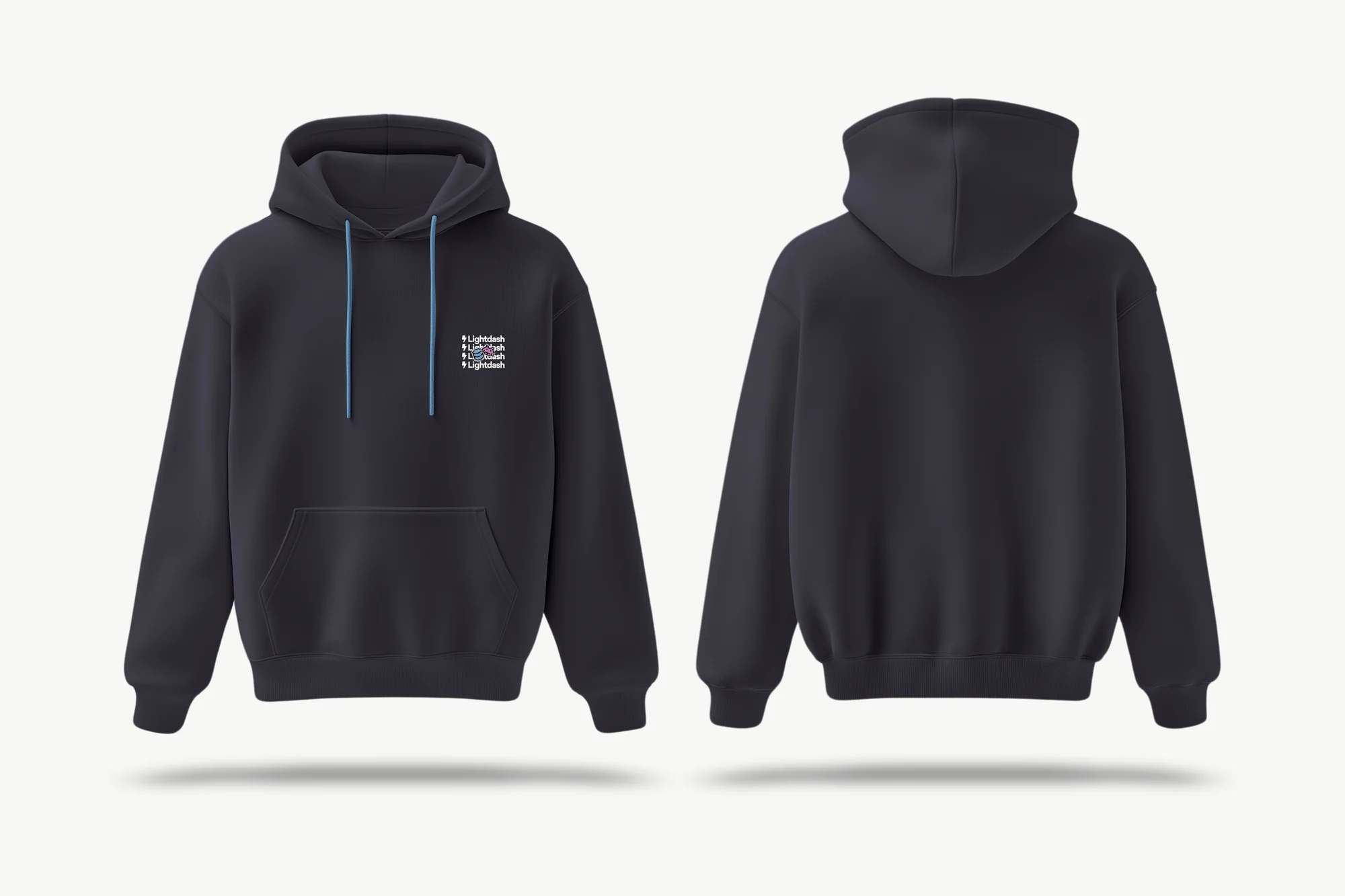
Front and back. 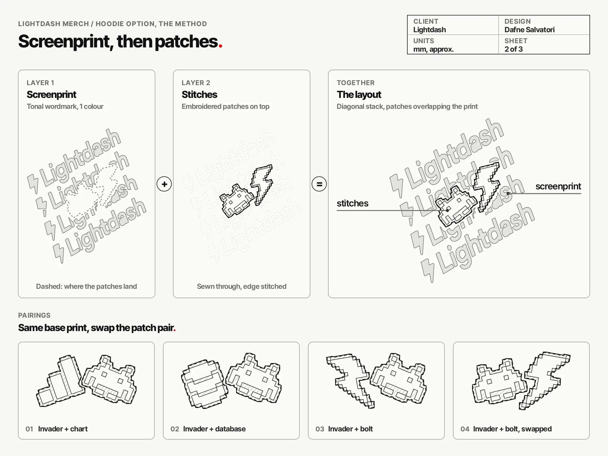
Screenprint first, patches on top. 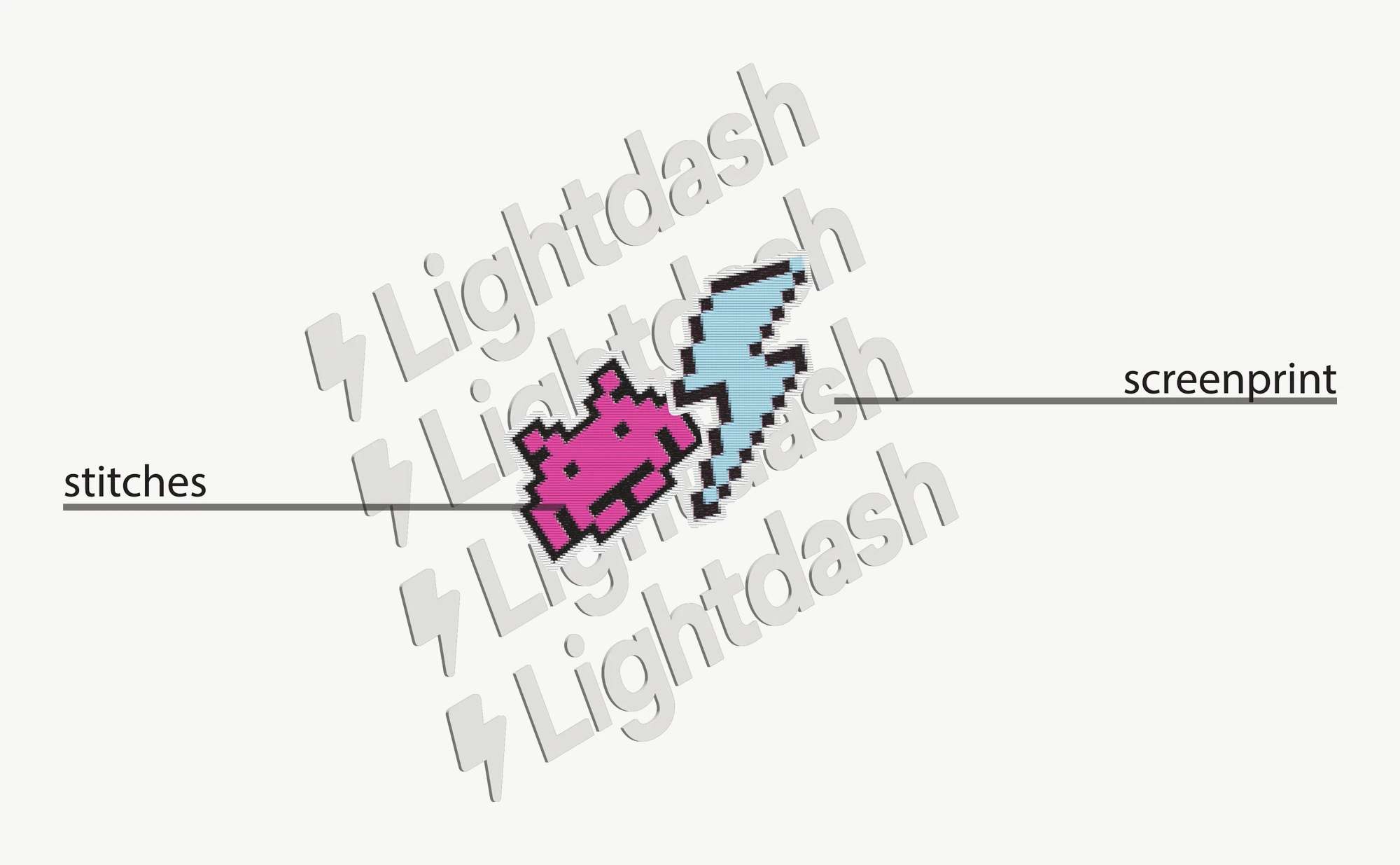
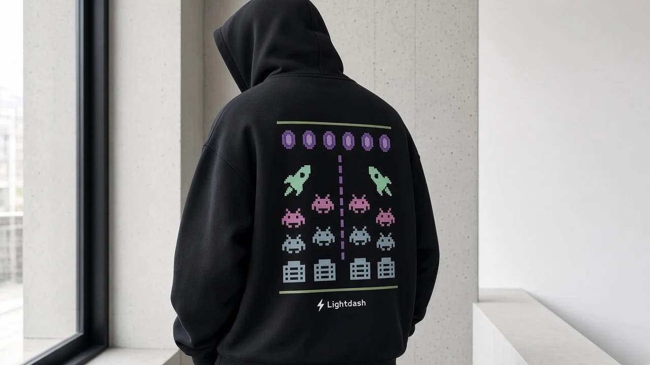
The layout. Defend the dashboard.
A retro game take on the Lightdash universe. Symbols of data discovery mix with arcade culture, and data icons become digital invaders, turning queries into a mission for insight. A soft cotton hoodie with pixel artwork inspired by old-school screens. Play with data. Defend the dashboard.
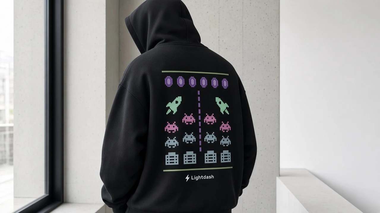
Data Invaders. 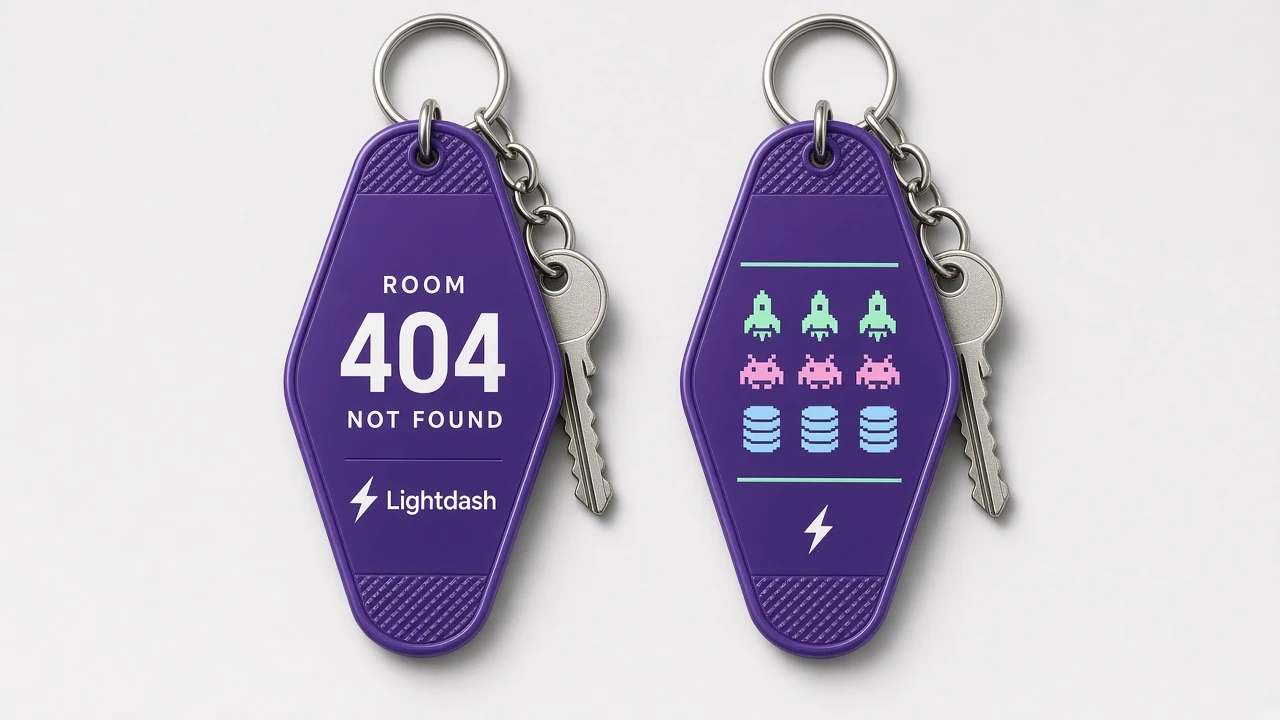
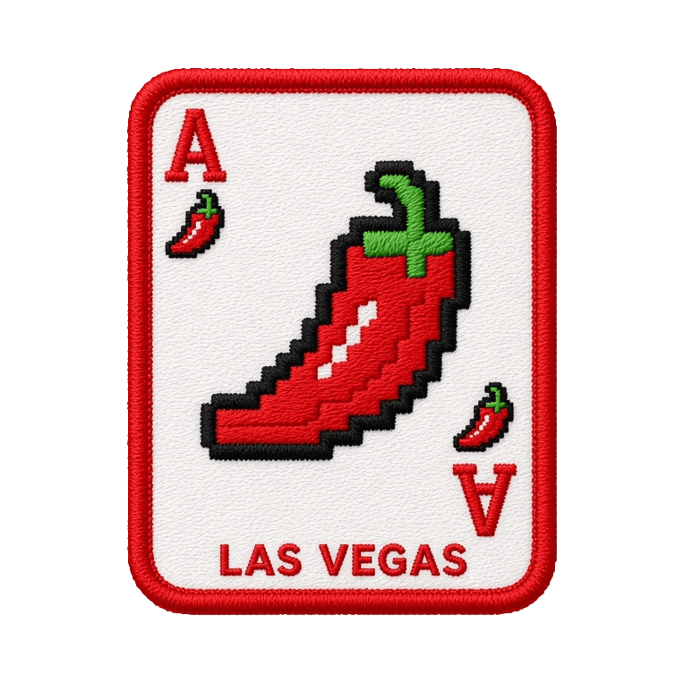
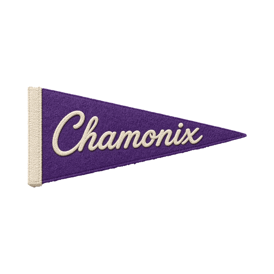
Room 404. Not found. Every trip earns a patch.
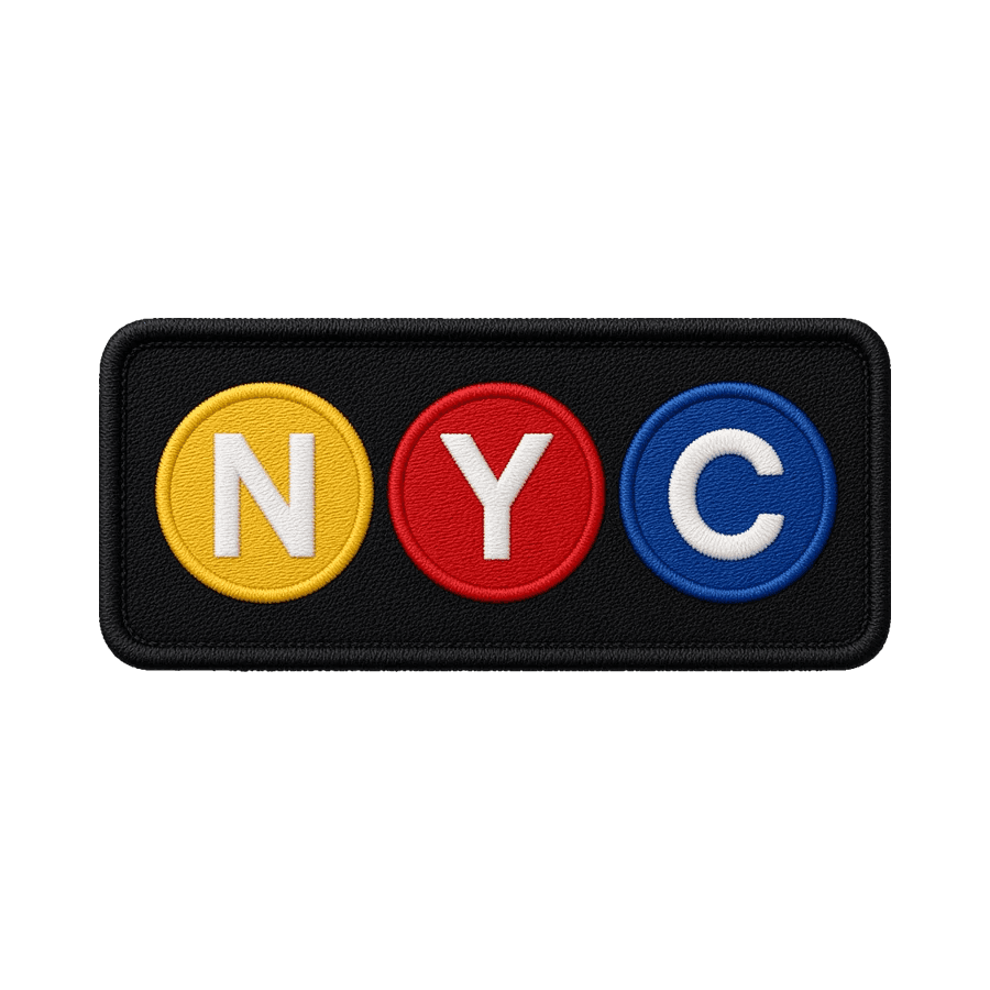
Every trip would add one new patch, from a conference in Las Vegas to an offsite in Chamonix. The team sews it onto their hoodie or tote, so the merch slowly turns into a record of where they've been together.


And socks.
The icon stack keeps to the system, the same pixel set running up the cuff. The flames don't.
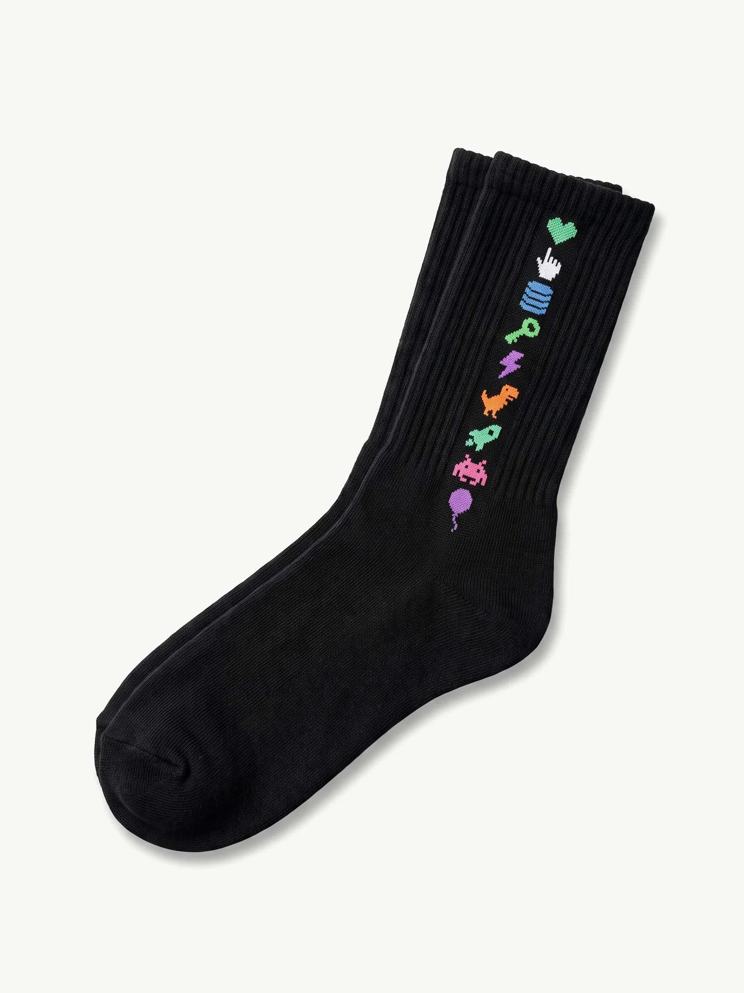
Icon stack. 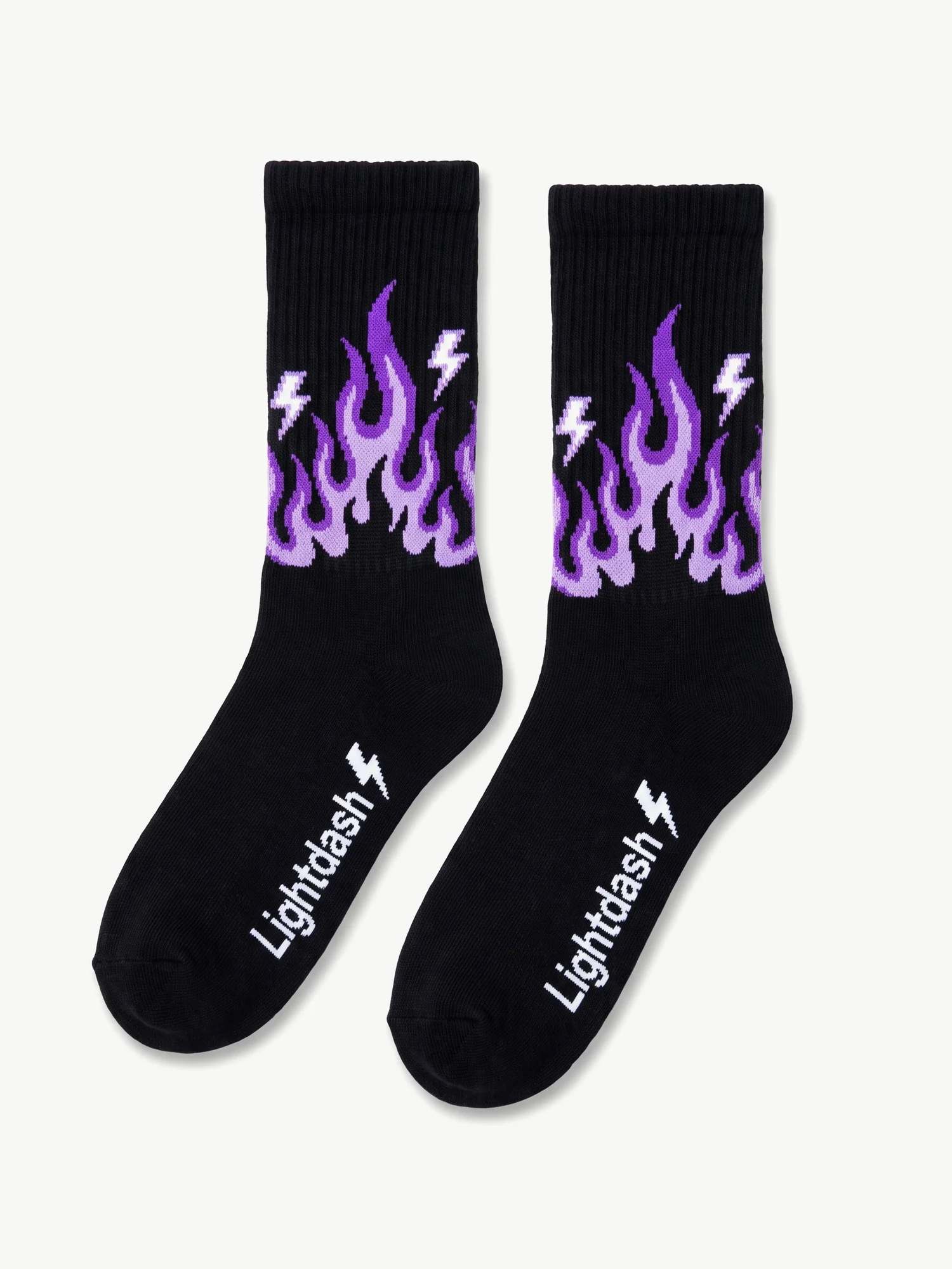
Off brief. They just looked too good not to make.
Outcome.
A small, modular system. Staples that anchor the brand, accents that keep it playful, and patches that tie merch to real milestones, not random designs.