De Paarse Keizerin: the crown comes back
De Paarse Keizerin has sold sex toys and sound advice to the Netherlands for fifteen years. Somewhere along the way it swapped its crown for two swans. I wanted the crown back, and a site that looks like the people who actually shop there.
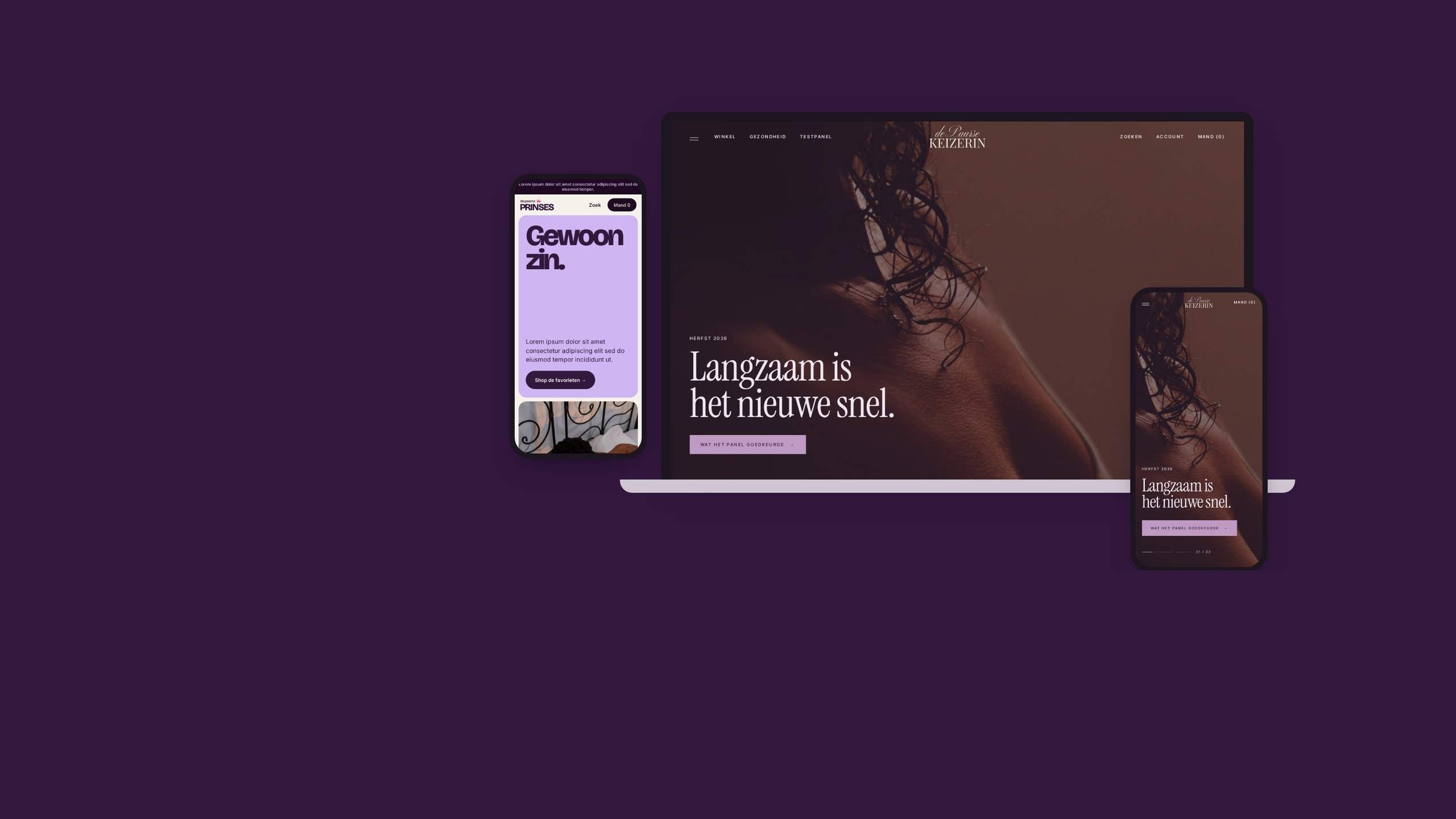
Strategy, identity, web design and prototypes for De Paarse Keizerin, 2026. Unrealised concept · shown with permission.
Problem.
The shop sells everything from lube to pelvic floor trainers. It knows more about menopause, vaginismus and erections than most of its competitors put together, and a test panel throws out whatever isn't good enough.
Most customers are over forty. The market either shows them as patients or doesn't show them. I set myself one brief: make it hot again, for people who are not old, just older.
Craft.
Swans and marble.
The homepage opens on two swans making a heart. Products sit on the same marble slab, page after page. I went through EasyToys, Pabo, Christine le Duc and Sinful: loud pink, price banners, or cool and Scandinavian. Nobody talks to a fifty year old woman who knows exactly what she wants. De Paarse Keizerin already does, in its advice pages. The site just hides it. The positioning I wrote on the first page of my notes: the expert who still knows how to flirt.
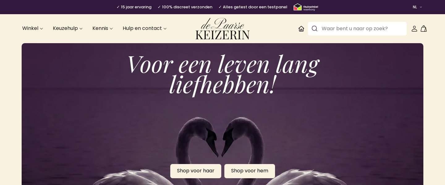
The live homepage, October 2026. 
Aubergine, plum, lilac, oxblood and bone. The crown.
I went back through the Wayback Machine. Every logo from 2011 to 2018 had a crown. In 2013 the homepage was fine art nudes on deep aubergine, and honestly it was braver than anything the brand does now. Then the crown went, and the heat left with it. Bringing it back is the one idea the rest of the proposal hangs on.
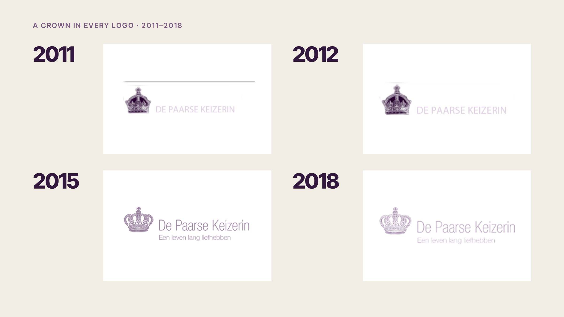
2011, 2012, 2015, 2018. 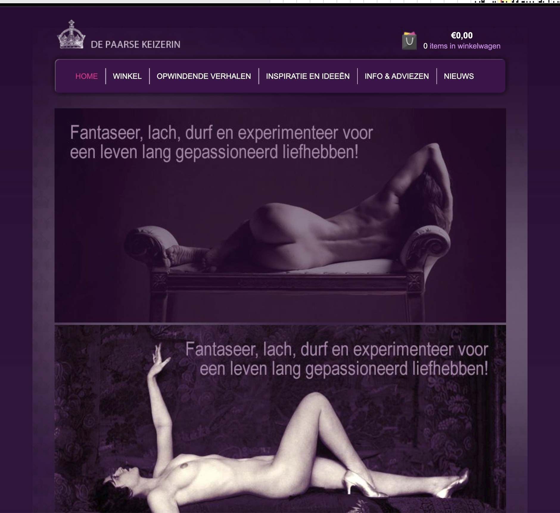
Home, 2013. Wayback Machine. 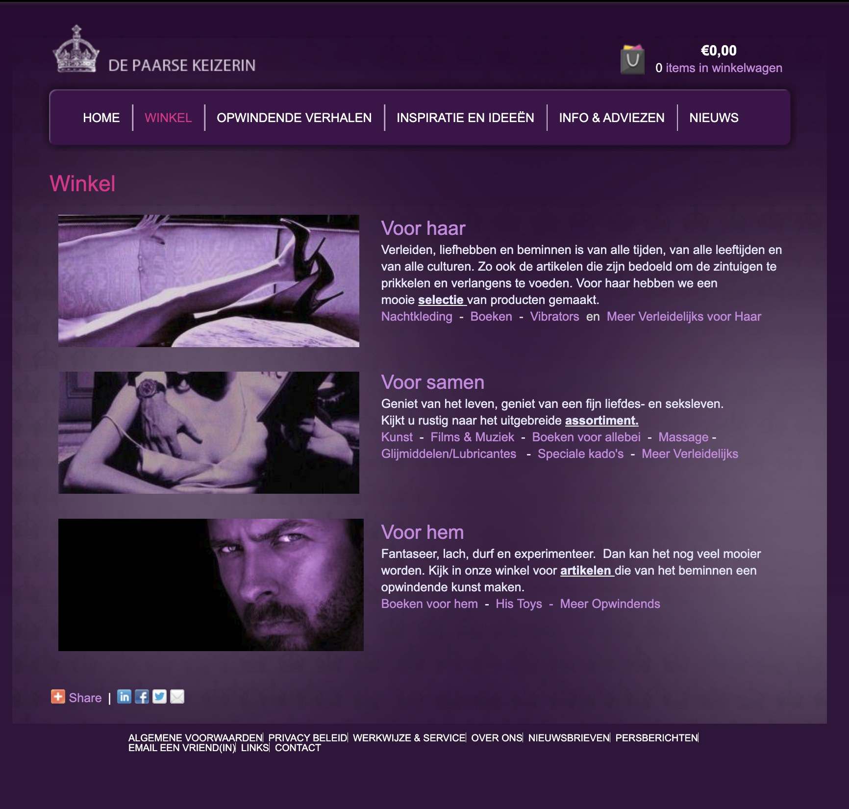
Winkel, 2013. A crown from the archive.
I found this one digging through archives. An engraved crown, much older than the shop, a bit too ornate for its own good. I liked it straight away. It looked like it had been waiting for De Paarse Keizerin. It works on its own: on test panel seals, above “Een leven lang liefhebben.”, and as a faint watermark on aubergine. Never next to the logo, the nav or the footer.
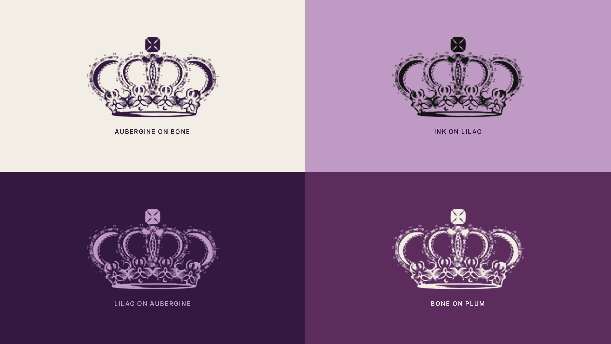
Four colourways. Darker, smaller, calmer.
Fifteen years of customers know the wordmark, so I kept it and made it smaller. Instrument Serif does the flirting, Inter Tight explains the dosage. The purple got darker. Lilac is an accent, never body text.
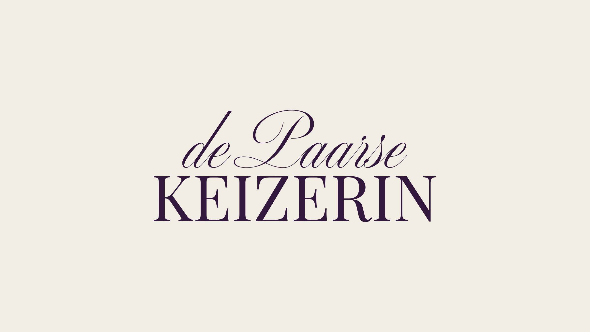
Wordmark on bone. 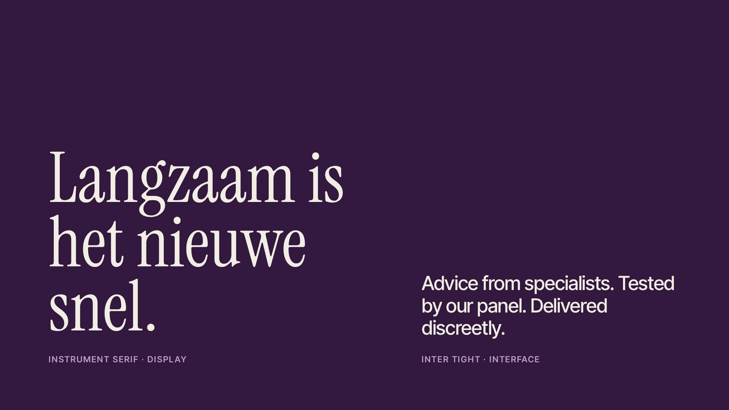
The type pair. Lose the marble.
Before any layout, I'd fix the product photos. LELO, Womanizer and Satisfyer already hand retailers beautiful campaign images, and the shop doesn't use them. So: the brand's campaign photo leads each product page. Cut outs go on one bone backdrop, same light, same angle. And the marble goes in the bin.
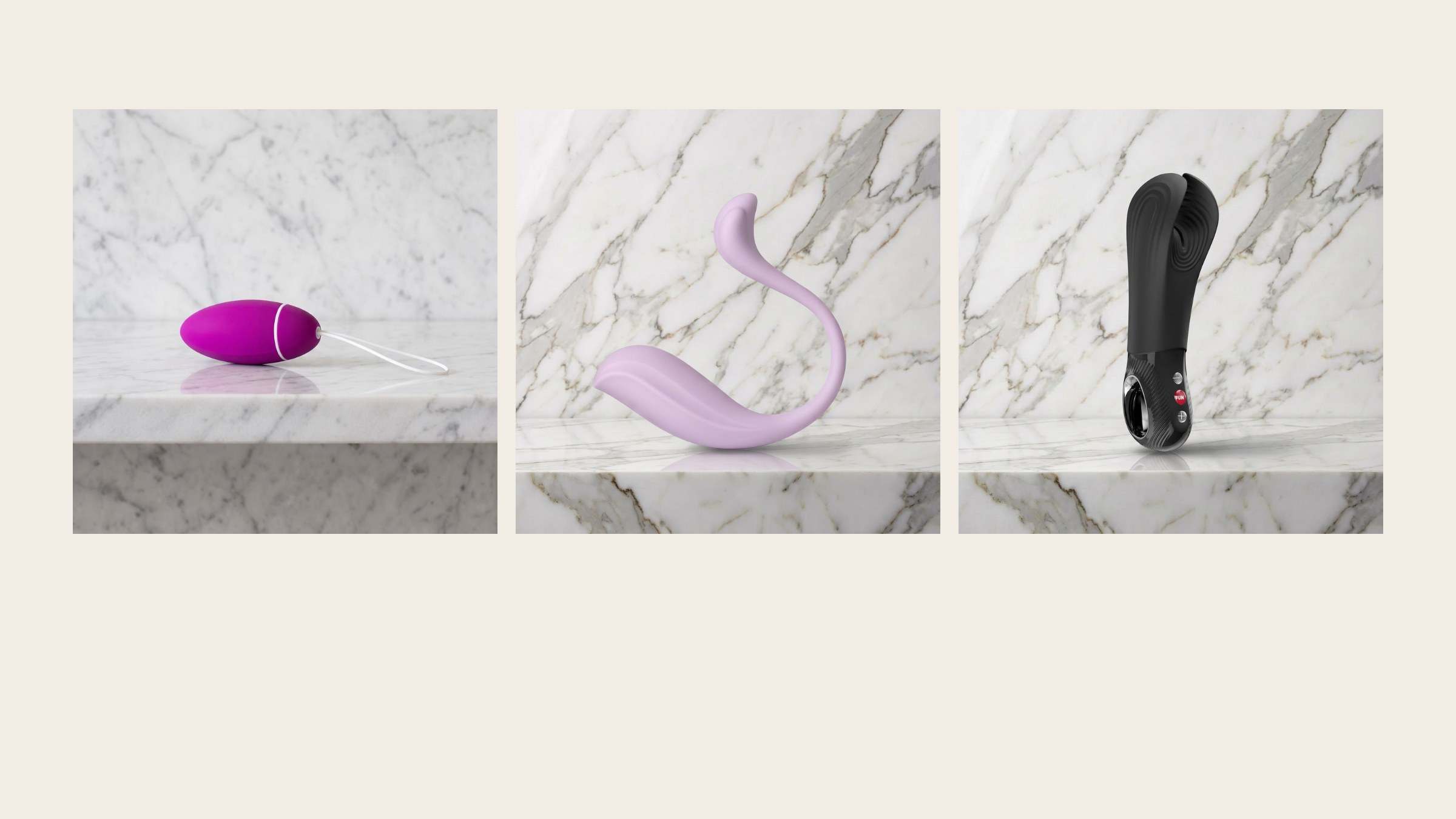
Now. 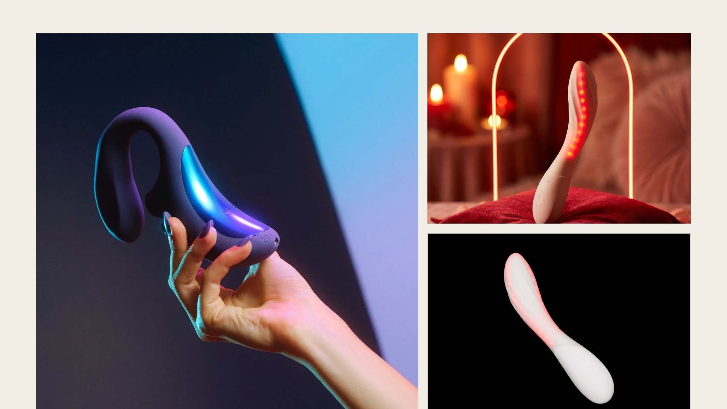
Proposed. LELO's own images. Gewoon zin.
This one started as a why not. A younger sister for 25 to 38 who says “je” instead of “u” and doesn't whisper. Same panel, same advice behind it. Her own logo, a loud pink and Bricolage Grotesque, with the family aubergine underneath. It means the Keizerin never has to pretend to be 28.
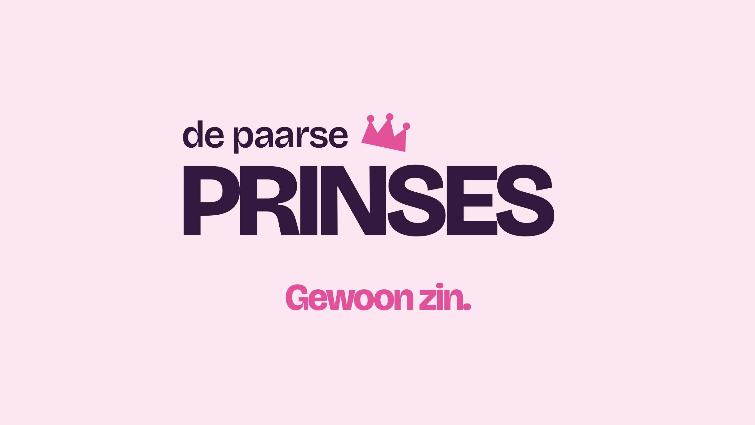
Logo. 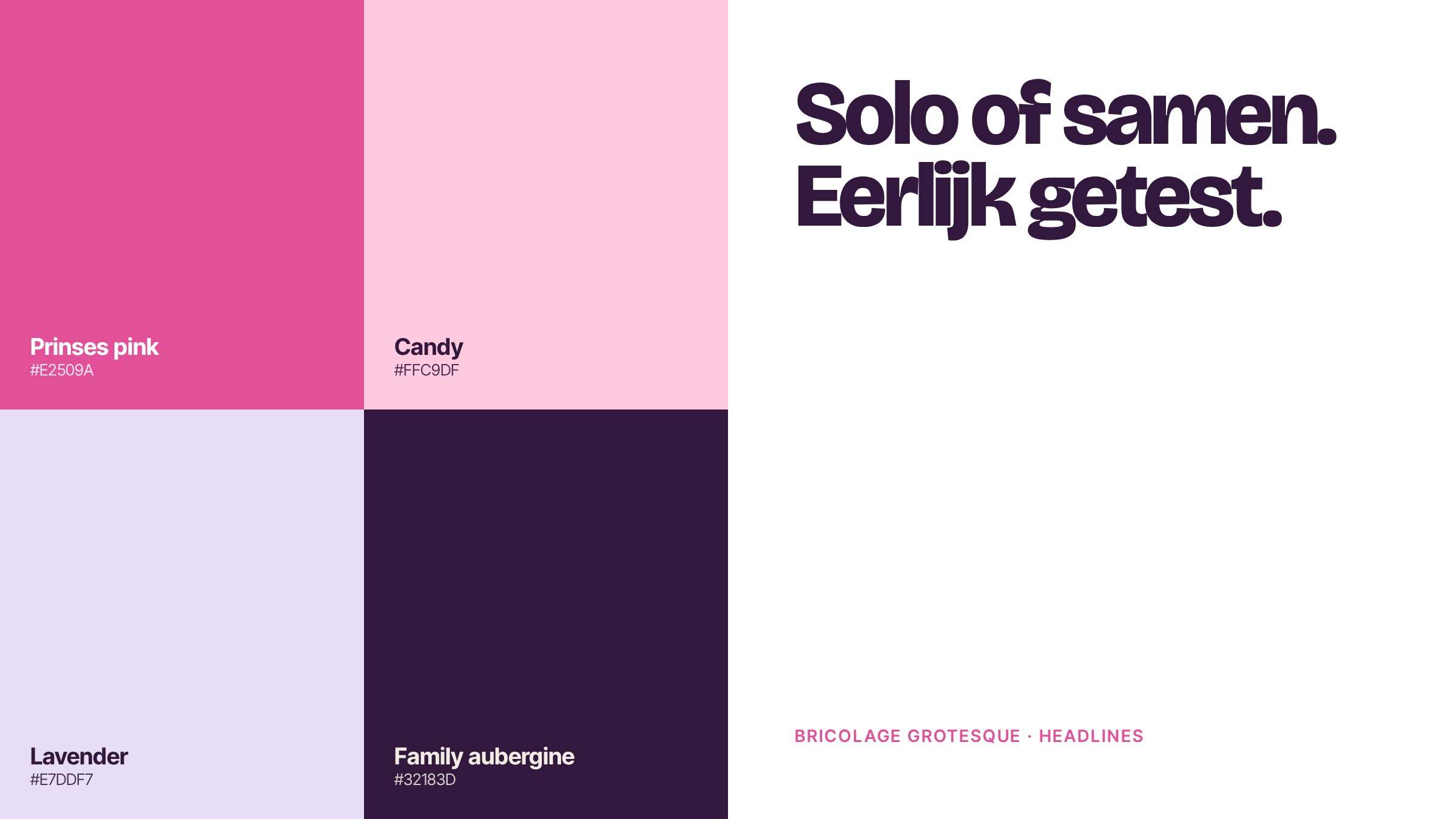
Pink, candy, lavender, and the family aubergine.
The sites.
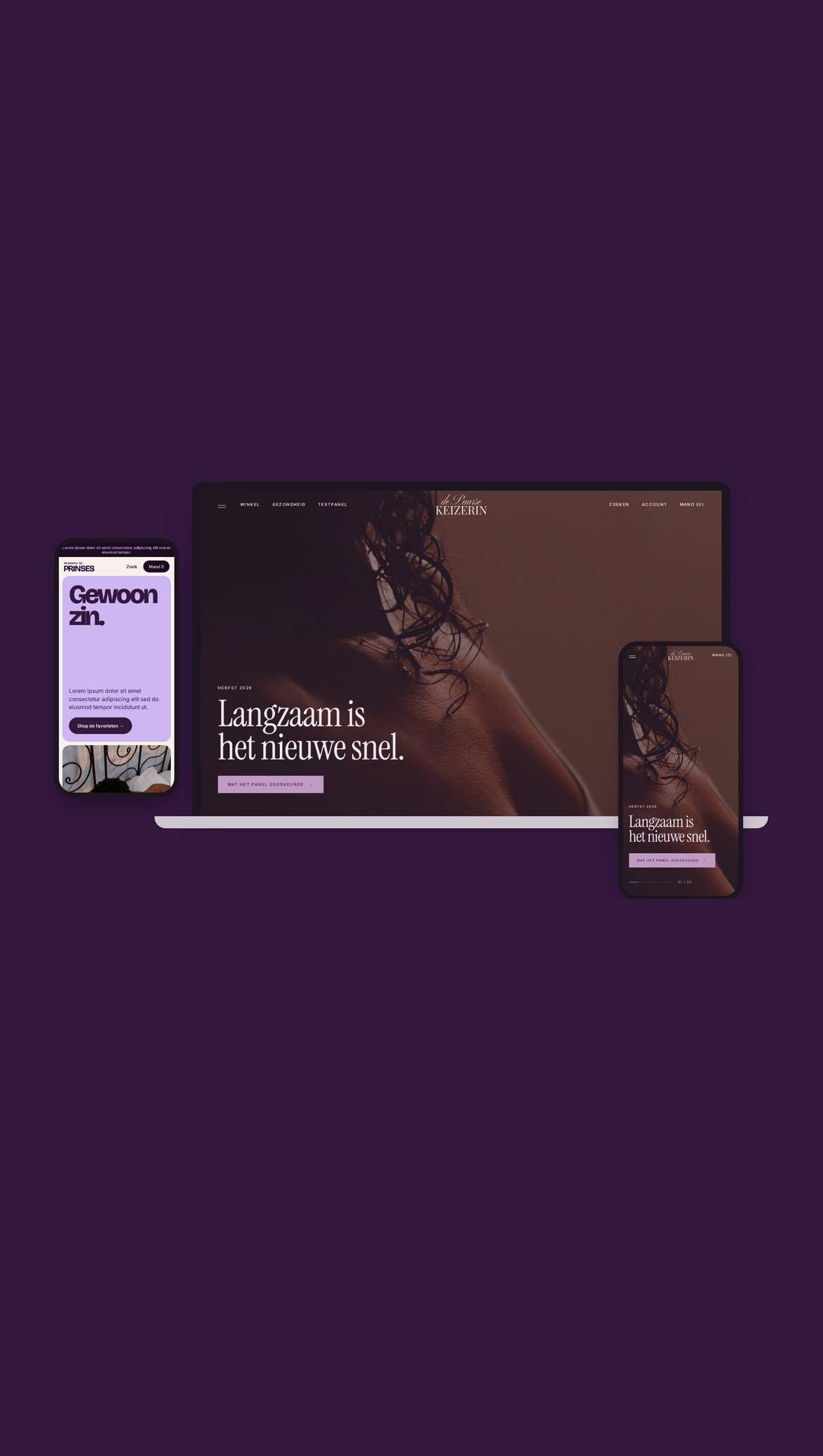
Two homepages, recorded from working prototypes.