Centre of attention

One circle. One brand. One idea.
Self-initiated and very, very unofficial. No brands were consulted, harmed or invoiced. Concept and art direction by Dafne Salvatori.
Problem.
While redoing my website, I went back to an old project: two posters I made for Asahi and Durex. And I did the thing every designer does. I cringed.
After a few years, most of us feel we have to redo old work because it doesn't feel relevant or good enough anymore. But once you work commercially, almost everything you make starts to feel "not good enough" to show. Client work comes with briefs, budgets, legal and a lot of opinions, so the portfolio is never quite you. Which means the redo cycle never really ends.
So I redid Asahi just for fun. The mistakes were right there: the alignment was off, the font choice was wrong, and a few other things I'd rather not list. Fixing it felt so good that I kept going, and it turned into a series with one rule: one centred circle, one brand, one idea.
Craft.
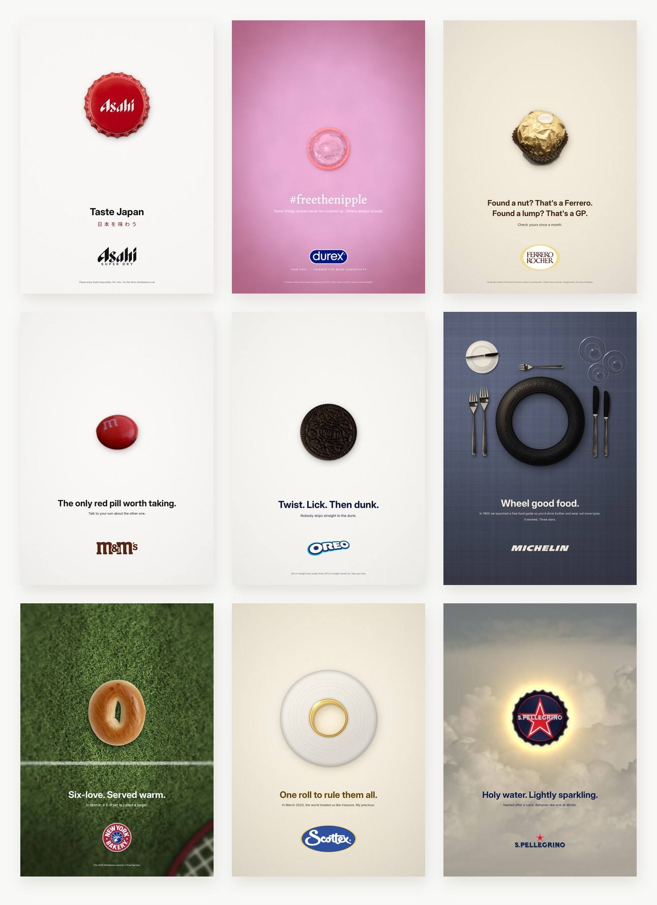
Asahi: Taste Japan.
A red Asahi bottle cap on a white field, sized and placed so the whole poster becomes the Japanese flag. The beer is Japanese, and so is the flag. The original that started all this.
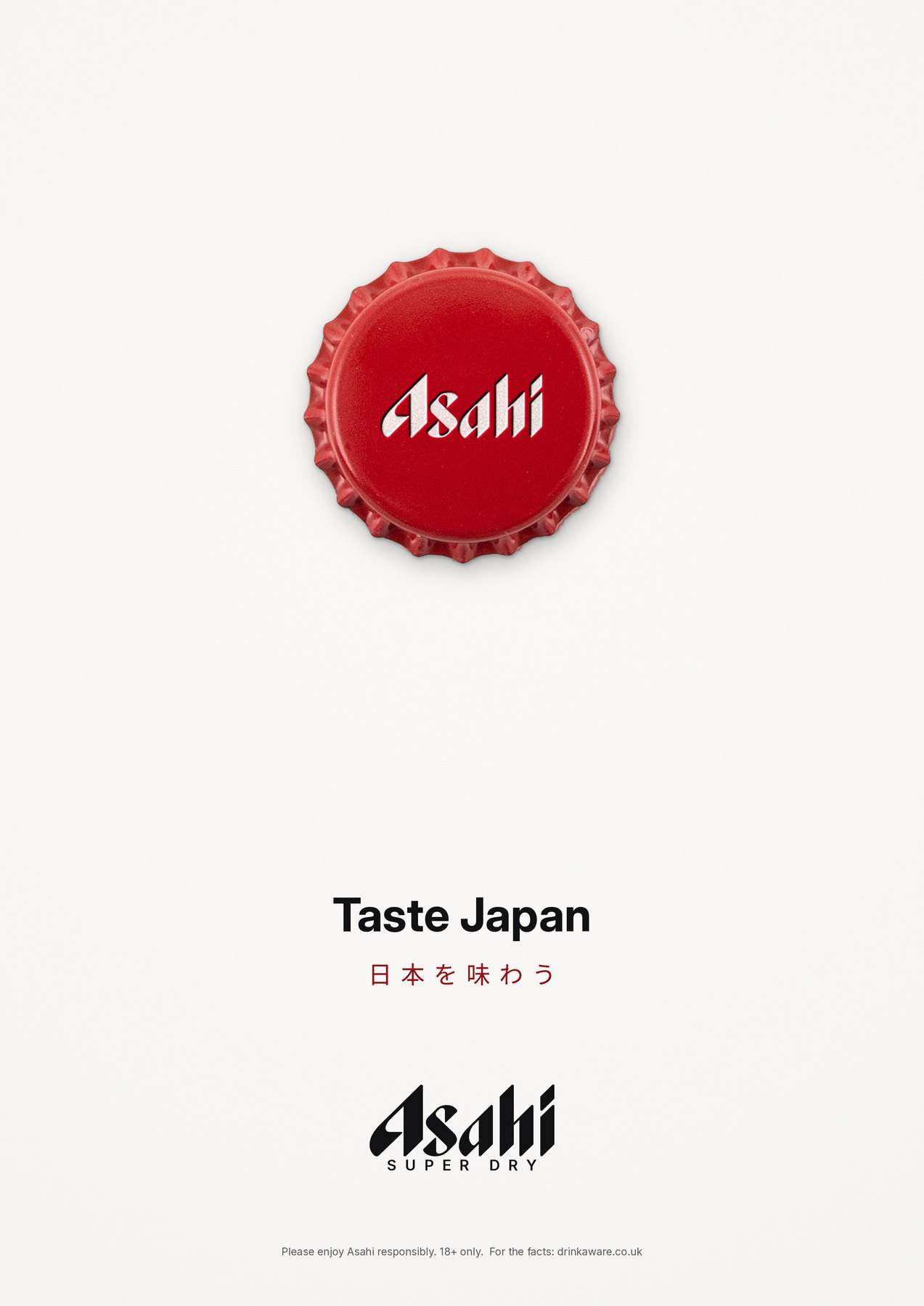
Durex: #freethenipple.
A condom seen from above on soft pink, which reads instantly as a nipple. Some things should never be covered up. Others always should.
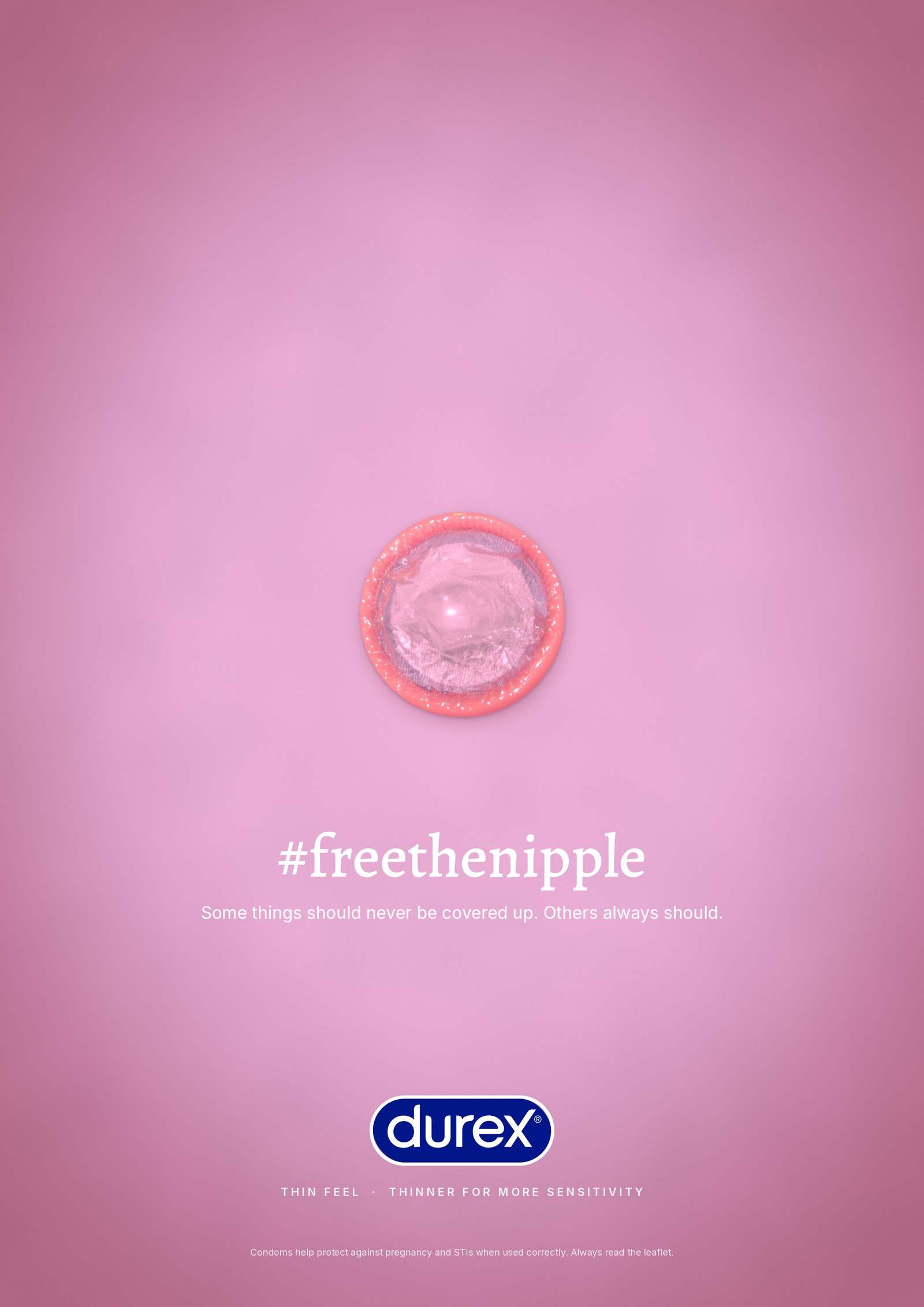
Ferrero Rocher: Found a nut?
"Found a nut? That's a Ferrero. Found a lump? That's a GP." Yes, it's a ball joke. It's also a reminder to check yourself once a month, because testicular cancer is the most common cancer in young men, and very treatable when it's caught early.
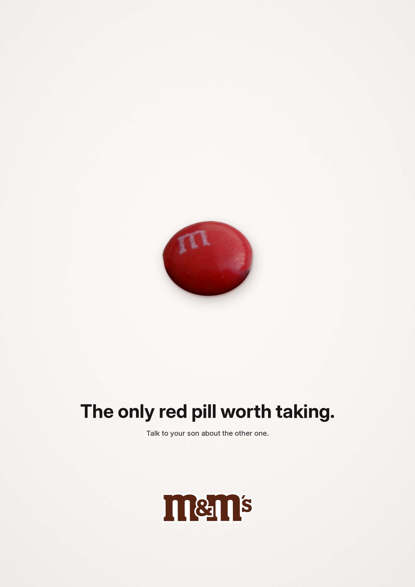
M&M's: The only red pill worth taking.
Guys, it's 2026. Enough with the red pill and the manosphere. If you need a red pill, take this one: it's chocolate, and it won't make you hate women.
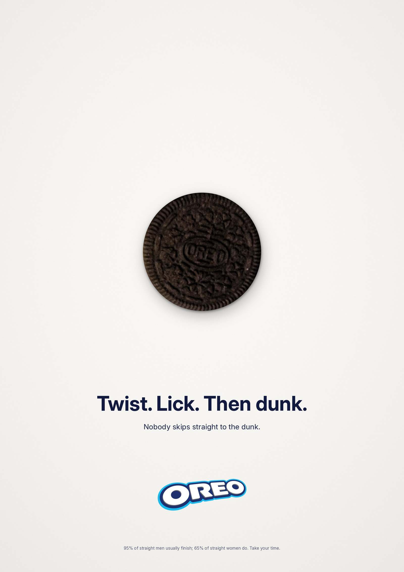
Oreo: Twist. Lick. Then dunk.
This one explains itself.
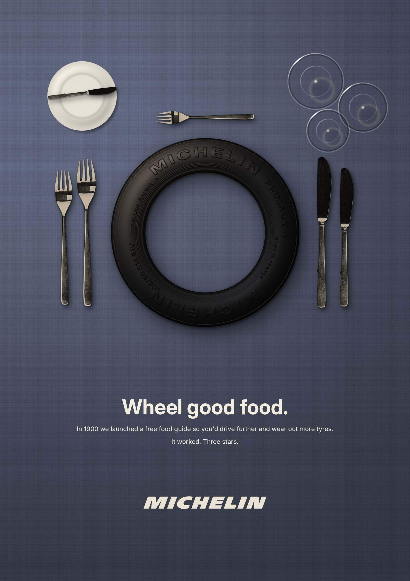
Michelin: Wheel good food.
Can you believe the tyre people gave us the restaurant stars? In 1900, Michelin made a food guide so you'd drive further and wear out more tyres.
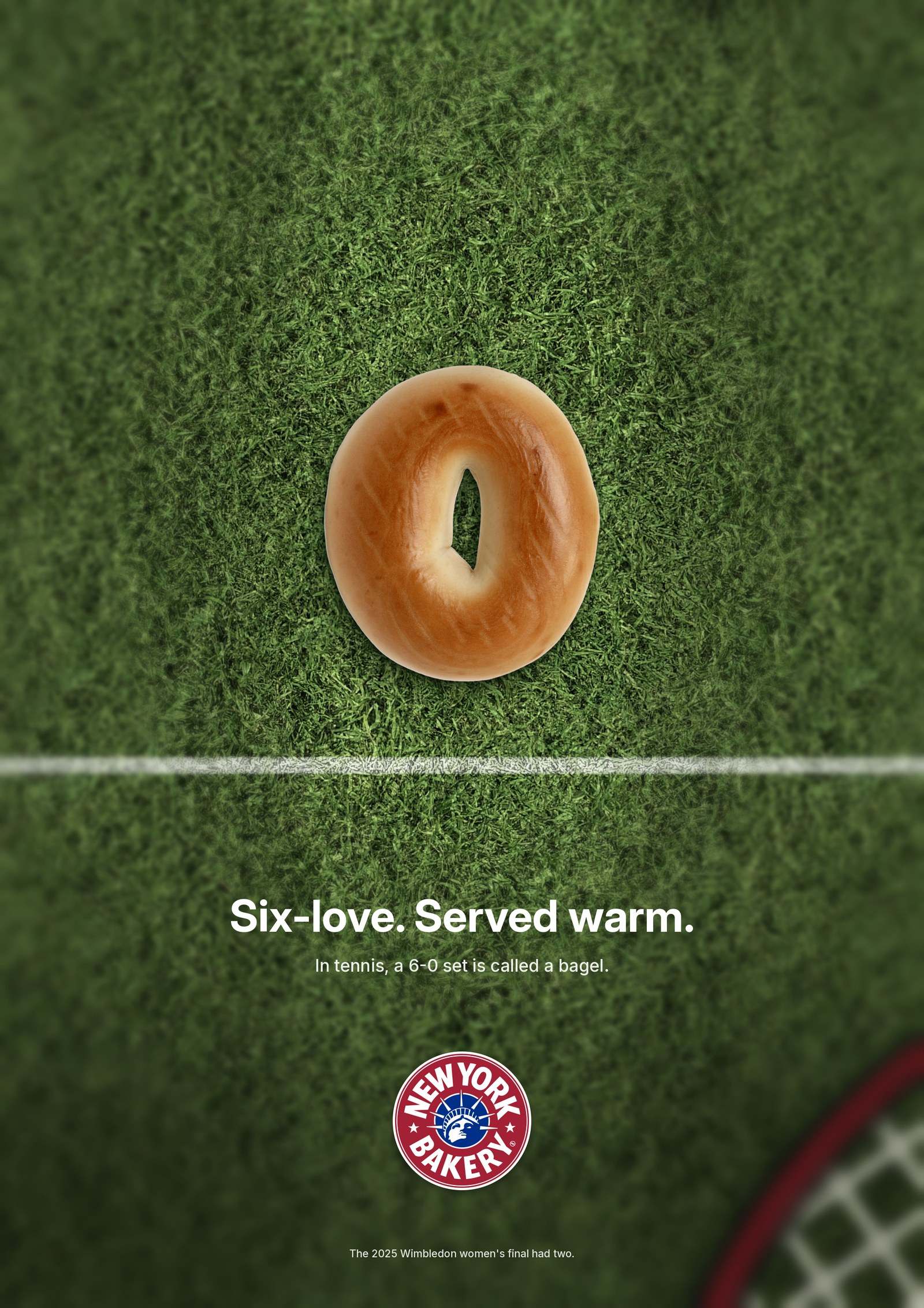
New York Bakery Co.: Six-love. Served warm.
I'm not a tennis fan. I'm a love and bagel fan, though. This one came from stumbling on a TikTok about Jannik Sinner, Italy's tennis darling, where I learned a 6-0 set is called a bagel. Sold.
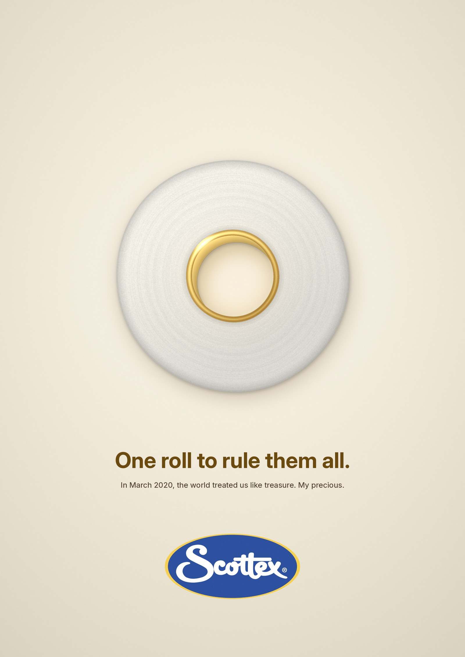
Scottex: One roll to rule them all.
Toilet paper. Covid. My precious. Circa 2020.
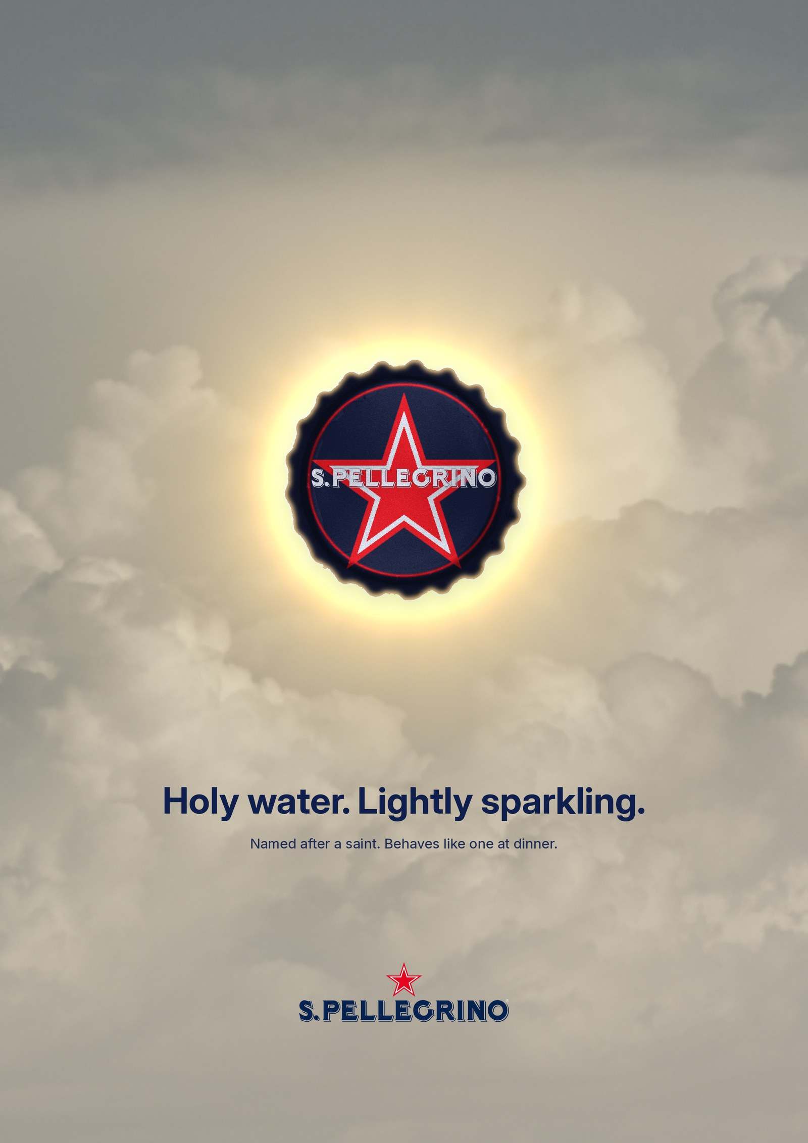
S.Pellegrino: Holy water.
Named after a saint, hence the halo. Lightly sparkling, heavily blessed, and the only thing at dinner that never needs confessing.
Outcome.
Self-initiated and very, very unofficial. No brands were consulted, harmed or invoiced. Concept and art direction by Dafne Salvatori.
Photo credit. Cutlery in the Michelin poster: Franz van Duns, CC BY-SA 4.0, edited.